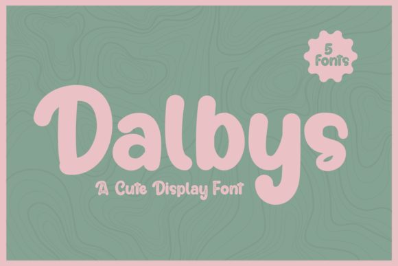
Dalbys: A Joyful Display Font for Web Designers
As a web designer who ships landing pages, SaaS dashboards, and boutique e-commerce sites, I treat typography like interface architecture—it shapes how users feel before they read a single word. Dalbys is one of those rare display fonts that lands with both personality and precision. It’s thick-lettered, yes—but not heavy or clunky. Its rounded terminals, gentle contrast, and generous x-height give it warmth without sacrificing clarity. And unlike many decorative fonts, Dalbys doesn’t sacrifice legibility at scale or on screen. That makes it unusually versatile in real-world digital layouts.
Where Dalbys Earns Its Place in Your UI Toolkit
Dalbys shines where tone and attention matter most: hero section headlines, product launch banners, course enrollment CTAs, and brand-led portfolio headers. Because it’s built as a display font—not a text or body typeface—it’s optimized for short bursts of high-impact messaging. Think “Join the Waitlist,” “New Collection Live,” or “Your Creative Journey Starts Here.” In those moments, Dalbys delivers joy without shouting. Its friendly weight and open letterforms hold up beautifully against image overlays, gradient backgrounds, and even subtle motion effects.
On mobile, Dalbys performs best above 32px for headlines and never below 24px—even on high-DPI screens. Avoid using it for paragraph copy, navigation labels, or form fields. But for bold section dividers (“What You’ll Learn,” “How It Works,” “Meet the Team”), it adds rhythm and brand distinction without disrupting vertical flow.
Building Visual Hierarchy—Without Sacrificing Trust
Strong visual hierarchy isn’t just about size—it’s about contrast in tone, shape, and intent. Dalbys introduces a distinct voice while keeping structural integrity. When paired with a clean sans serif like Inter, Poppins, or Manrope for body copy and UI elements, it creates an intentional, professional duality: expressive headline + grounded interface. That balance supports conversion-focused layouts by guiding the eye *and* reinforcing credibility. Users don’t just notice your headline—they associate its warmth with your brand’s approachability.
For editorial-style sites or coaching platforms, consider pairing Dalbys with a warm serif like Cormorant Garamond or Playfair Display for subheads or pull quotes. The contrast between Dalbys’ playful thickness and a refined serif’s elegance signals thoughtfulness—not trend-chasing.
Real Layouts Where Dalbys Adds Value
- Creative portfolios: Use Dalbys for project titles over full-bleed imagery—it anchors emotion while staying scannable.
- Boutique online stores: Apply it to seasonal campaign banners (“Summer Edit Live”) or limited-edition product badges.
- Course sales pages: Deploy it for key benefit headlines (“Learn at Your Pace,” “No Prior Experience Needed”)—its friendliness lowers perceived barriers to entry.
- App onboarding flows: Try Dalbys for welcome screen headers (“Welcome to FlowSpace”)—it softens technical interfaces without diluting professionalism.
- Blog headers & social graphics: Export lightweight PNGs or SVGs for consistent use across platforms, especially when branding needs cohesion beyond the website.
Practical Considerations for Digital Deployment
Dalbys is typically delivered as a WOFF2-optimized webfont bundle, supporting modern browsers and responsive loading strategies. Check whether your license includes variable font support—if so, you gain fine-grained control over weight and width adjustments directly in CSS. Most versions include uppercase-only glyphs, standard punctuation, and Latin-1 character coverage (covering English, Spanish, French, German, and more). For multilingual SaaS tools or global brands, verify extended language support before purchase.
Always test Dalbys against your site’s background contrast ratios. On light backgrounds, it reads cleanly at 400–600 weight. Over dark gradients or photos, consider a subtle text shadow (text-shadow: 0 1px 2px rgba(0,0,0,0.2)) or light stroke for extra definition—never rely solely on color contrast alone.
Licensing That Matches Your Workflow
Dalbys is a commercial font—and that matters. If you’re building client websites, selling digital templates, or powering an online store, ensure your license covers web embedding, multiple domains, and resale rights where applicable. Many premium display fonts offer tiered licensing: single-site, agency, or extended. Don’t assume a desktop license covers web use—most do not. Always review the EULA before deploying Dalbys into production environments, especially if your site uses dynamic content generation or third-party CMS integrations.
When to Reach for Dalbys—And When to Hold Back
Dalbys excels in contexts where brand tone leans warm, human-centered, or creatively confident—think design studios, wellness coaches, indie makers, and lifestyle brands. It’s less suited for finance dashboards, enterprise B2B tools, or legal compliance pages where neutrality and authority take priority over charm.
Also avoid overusing it. One strong application per page—hero headline, primary CTA button label, or featured testimonial quote—is enough. Too many Dalbys instances compete for attention and weaken hierarchy. Let it breathe. Let it land.
In the end, Dalbys isn’t just another display font. It’s a deliberate tone-setting tool—one that helps digital products feel intentionally joyful, not accidentally cute. Used with restraint and paired with purpose, it becomes part of your brand’s quiet confidence: clear in voice, consistent in execution, and unmistakably human.