Lion Card: A Playful, Geometric Display Font for Digital Brands
Two weeks ago, I was finalizing the hero section of a boutique online store for a ceramicist—clean layout, warm neutral photography, hand-thrown pieces front and center. The client wanted “joyful but grounded,” something that felt human-made, not algorithmically polished. That’s when I dropped Lion Card into the headline: “Glazed by Hand. Made to Last.” Instantly, the tone shifted—not louder, but *more intentional*. It wasn’t just typography; it was a quiet brand signature.
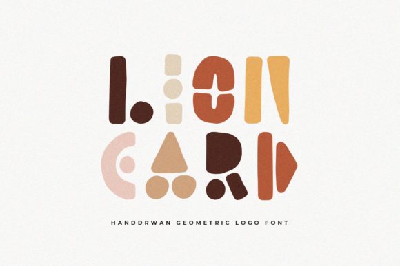
Lion Card is a display font with unmistakable character: geometrically structured, yet unmistakably hand-drawn. Think precise circles and confident angles softened by subtle irregularities—the slight wobble in a curve, the gentle taper on a stroke. It’s playful without tipping into childishness, structured without feeling rigid. That balance makes it unusually versatile for digital interfaces where personality and clarity must coexist.
In practice, I used Lion Card exclusively for high-impact, short-form moments: the main headline, the subhead (“Each piece is signed and fired twice”), and the “Shop the Collection” button. I avoided body copy, navigation labels, or form fields—this isn’t a workhorse font. It’s a spotlight font. And it worked because every use case had breathing room: generous letter spacing, ample line height, and a clear visual hierarchy anchored by a clean sans serif (I chose Inter for all supporting text). That pairing—Lion Card + Inter—became the site’s typographic heartbeat: expressive up top, effortlessly legible below.
On mobile, I tested Lion Card at 32px for headlines and 24px for buttons. It held up well—but only because I kept lines short. Anything longer than six words started to feel dense. So for the product cards on scroll, I switched to Inter bold for titles and reserved Lion Card for the “New Glaze Drop” banner above the grid. That small edit preserved scannability while keeping the font’s charm intact.
Readability on image overlays was another real-world check. Over a softly blurred photo of a kiln shelf, Lion Card in white at 60% opacity read cleanly—thanks to its generous x-height and open counters. But on darker, busier backgrounds (like a textured clay swatch), I added a subtle semi-transparent background behind each word. Not a hack—just respectful treatment of a display font’s limits.
What surprised me most was how Lion Card shaped perception of professionalism. At first glance, some might assume a hand-drawn font feels “less serious.” But in context—paired thoughtfully, sized intentionally, spaced generously—it communicated craft, care, and confidence. Users didn’t see “quirky”; they saw *intention*. That nuance matters for coaching websites, portfolio sites, and course sales pages where trust is built through consistency—not sterility.
I also tested Lion Card on a campaign landing page for a weekend design workshop. There, it lived in three places: the hero headline (“Think. Sketch. Ship.”), the section divider (“Your Tools, Refined”), and the CTA button (“Reserve Your Spot”). No headings beyond H1, no lists, no captions. Just strategic punctuation. That restraint kept attention where it belonged—and made the font feel like part of the experience, not decoration tacked on.
For logo text? Yes—but only if the brand leans into tactile, artisanal, or joyful energy. It wouldn’t suit a fintech dashboard or legal SaaS platform. But for a creative studio, an indie bakery’s online shop, or a mindfulness coach’s homepage? Absolutely. Just remember: Lion Card shines brightest when it’s *the only* expressive element on screen. Layer it with other decorative fonts or heavy iconography, and it loses its voice.
Before deploying, I double-checked what came in the package: one weight (regular), OpenType features including stylistic alternates (a few charming glyph swaps for “A”, “R”, and “S”), and webfont-ready WOFF2 files. No italic, no bold variants—so I relied on Inter’s full weight range for contrast. Licensing was straightforward: commercial use included, no per-page fees. That simplicity mattered—I didn’t need to track usage across client sites or worry about embedding restrictions in a WordPress theme.
Font pairing is where Lion Card truly earns its keep. It pairs beautifully with neutral sans serifs (Inter, Manrope, Poppins) for digital-first brands. With a warm serif like Literata or Cormorant Garamond, it adds editorial depth—ideal for blog headers or digital brand kits meant for both web and print. Avoid pairing it with other display or script fonts; its personality is strong enough to stand alone.
One note on loading: Because Lion Card is a single-weight display font, it’s lightweight—under 40KB as WOFF2. No FOIT or FOUT drama. It loads fast, renders crisply, and doesn’t compete with your LCP metrics. That’s rare for expressive typefaces, and worth celebrating.
Is Lion Card for everyone? No. It’s not for enterprise dashboards or dense documentation. But if you’re designing a portfolio that reflects your process, a product landing page that celebrates making, or a coaching site that values warmth over polish—then Lion Card isn’t just a font choice. It’s a design decision with texture, rhythm, and quiet confidence. It says, without shouting: This was made by hand. You’re welcome here.
- Best for: Hero headlines, section dividers, CTA buttons, shop banners, blog headers, digital ads
- Avoid for: Long paragraphs, navigation menus, data tables, small mobile buttons (<16px)
- Pair with: A neutral sans serif (for UI clarity) or a gentle serif (for editorial depth)
- Check before use: Webfont format support, licensing scope, included weights/alternates, multilingual character coverage