Alphina: A Display Font That Elevates Digital Branding
It started with a hero section—just me, a new coaching website mockup, and a blank headline space begging for personality. I’d tried three fonts already: one too clinical, one too fussy, one that vanished on mobile. Then I loaded Alphina. Within seconds, the headline “Clarity Begins Here” felt less like text and more like an invitation—warm, intentional, quietly confident. That’s when I knew this wasn’t just another display font. It was a design collaborator.
A Typeface Built for Visual Hierarchy—and Human Connection
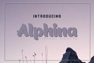
Alphina is, first and foremost, a display font—but not in the flashy, attention-grabbing way some are. Its charm lives in subtlety: the way its weights shift—from delicate hairlines to softly grounded semibold—without ever clashing. There’s no jarring contrast, no visual shouting. Just harmony. That balance makes it uniquely effective in digital spaces where clarity and calm coexist: landing pages for mindful brands, portfolio headers for illustrators, or course sales pages where trust matters more than volume.
I tested it across real layouts: over soft-gradient image banners, against crisp white backgrounds, and even layered lightly on textured photography. In every case, Alphina held its own—not by dominating, but by *belonging*. Its letterforms have gentle terminals, open counters, and just enough character to feel handmade without sacrificing polish. It reads as both contemporary and timelessly thoughtful—ideal for brands that value authenticity over trend-chasing.
How It Performs Where It Counts
On desktop, Alphina shines in hero titles, section headings, and CTA buttons—especially at 36–64px. At those sizes, its weight variation adds dimension without needing shadows or outlines. But what surprised me most was how gracefully it scaled down. At 24px on tablet, it remained legible and expressive; even at 20px on mobile (used sparingly for subheadings), it retained its warmth—provided the line height stayed generous and the background offered solid contrast.
One real test: a boutique online store’s seasonal campaign page. I set the banner headline in Alphina Bold, paired with Inter Regular for body copy and product descriptions. The result? Instant tonal cohesion. Shoppers didn’t just read the message—they paused. Scrolling slowed. That subtle emotional lift? It came from typography doing quiet, confident work.
Where Alphina Excels—and Where to Pause
✅ Perfect for:
- Hero section headlines and taglines
- Section dividers and feature titles
- Logo lockups (when used as primary wordmark)
- Digital brand kits—especially for creative, wellness, or lifestyle businesses
- Animated micro-interactions (its clean shapes render smoothly)
- Blog post headers and newsletter subject lines
⚠️ Not ideal for:
- Body copy or paragraph text (it’s a display font—designed for impact, not endurance)
- Small navigation labels or form inputs (lacks the functional neutrality needed there)
- High-contrast accessibility-critical interfaces (check WCAG contrast ratios—some lighter weights need careful background pairing)
- Dense dashboard UIs or data-heavy admin panels
Smart Pairing Makes All the Difference
Alphina doesn’t need competition—it needs context. I consistently paired it with Inter (a highly legible, open-source sans serif) for body text, and it worked beautifully: modern but grounded, expressive but never distracting. For a more editorial feel—say, a writer’s portfolio—I swapped in IBM Plex Serif, letting Alphina’s warmth play off structured serifs. Both pairings reinforced hierarchy while keeping tone consistent.
What made the difference wasn’t just contrast in style—it was contrast in *purpose*. Alphina handles voice and identity; its partner handles function and flow. That duality is where strong web typography lives.
Practical Notes Before You Implement
Before dropping Alphina into your next project, check a few key things:
- Webfont formats: Confirm WOFF2 support—it’s lean, fast, and widely supported.
- Weight range: Alphina includes at least four distinct weights (Light, Regular, Medium, Bold). Use them intentionally—not just for size, but for emphasis and rhythm.
- Ligatures & alternates: Some versions include discretionary ligatures (like “fi”, “fl”) and stylistic alternates—great for logos or hero text, but disable them in CMS-driven content unless you’re manually curating each instance.
- Licensing: Verify commercial web use rights—especially if embedding in client sites, SaaS platforms, or downloadable templates.
- Multilingual support: If your audience spans languages beyond English, check glyph coverage for accented characters and extended Latin sets.
And one small but vital tip: always preview Alphina in your actual layout—not just in Figma or Adobe Fonts. Load it live on staging, scroll through mobile breakpoints, and test with real content. Typography reveals its true nature in motion and context, not isolation.
More Than a Font—A Design Decision With Intention
Using Alphina isn’t about swapping one typeface for another. It’s choosing to lead with warmth in a digital space often optimized for speed over soul. It’s trusting that a carefully weighted “A” or a gently tapered “S” can whisper confidence before a single word is read. In a world of sameness, Alphina doesn’t shout originality—it embodies it, quietly, consistently, and with remarkable grace.
Whether you’re refining a founder’s homepage, launching a new course, or building a brand kit for a creative client, Alphina invites you to slow down just enough—to choose meaning over momentum, harmony over hype, and humanity over habit.